Standard NOAA Colors vs. Custom Color Nautical Chart Wallpaper
A nautical chart has an immediate sense of place. It traces the water, shoreline, harbor entrances, shoals, channels, depth markings, and familiar routes that matter to the people who know them. When that chart is enlarged as custom nautical chart wallpaper, it becomes more than a chart. It can tell a story, anchor a room, and bring a refined maritime element to any interior design.
One of the most important decisions is color. Should the chart stay true to its original NOAA nautical chart colors, or should the palette be adjusted to better complement the space?
The answer depends on the setting, the chart, and the client’s relationship to the locale. Some walls call for the authenticity of standard NOAA colors. Others benefit from a more tailored approach. Our design projects are not simply about choosing “traditional” or “custom”; they are about understanding how the chart should live within the room.
At Nautical Chart Wallpaper, every project is created specifically for our clients. That means color is never a one-size-fits-all decision. We can preserve the NOAA chart palette, make a subtle adjustment, or create fully custom nautical chart wallpaper designed to match your theme.

Why Standard NOAA Chart Colors Remain So Popular
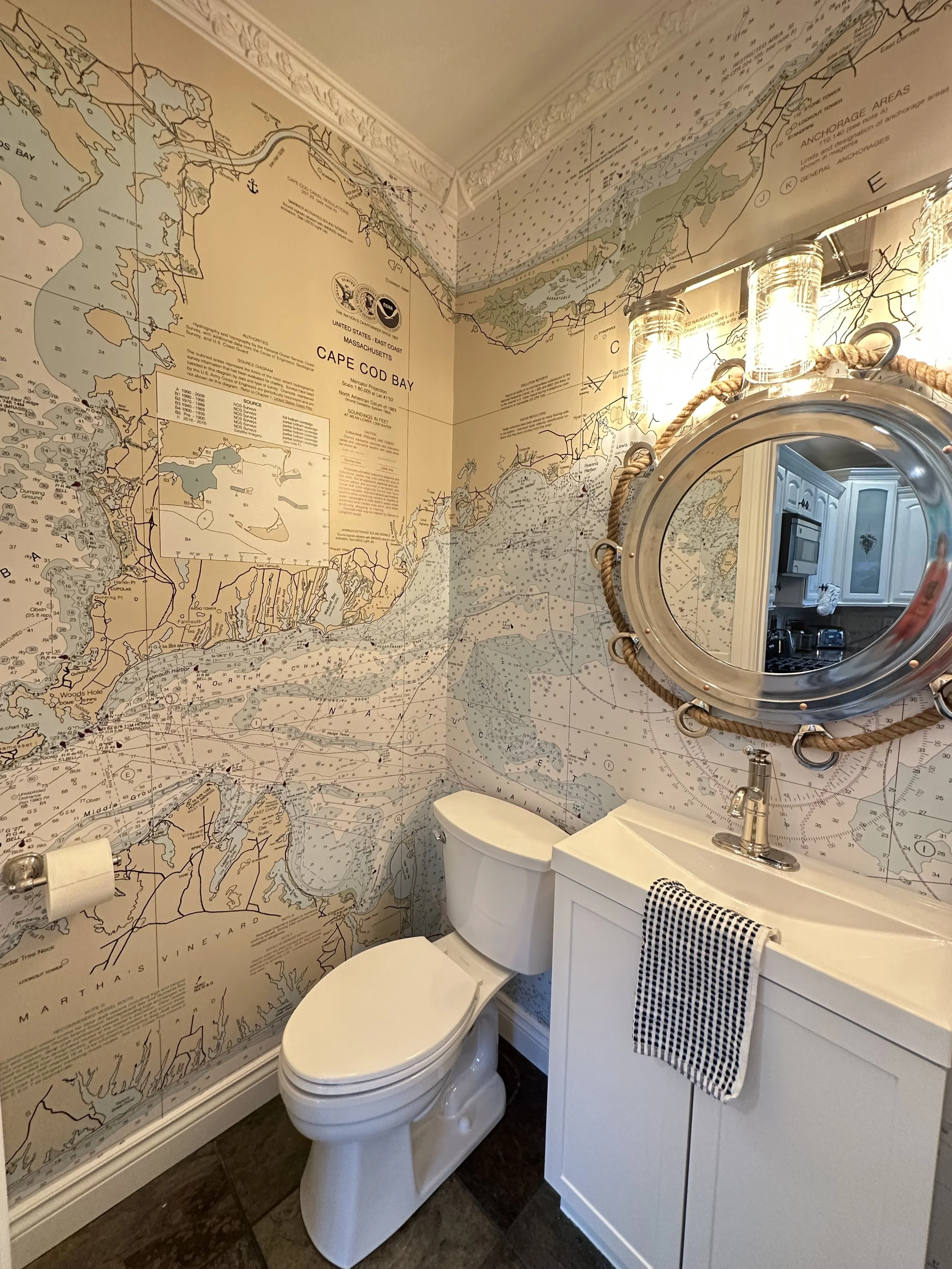
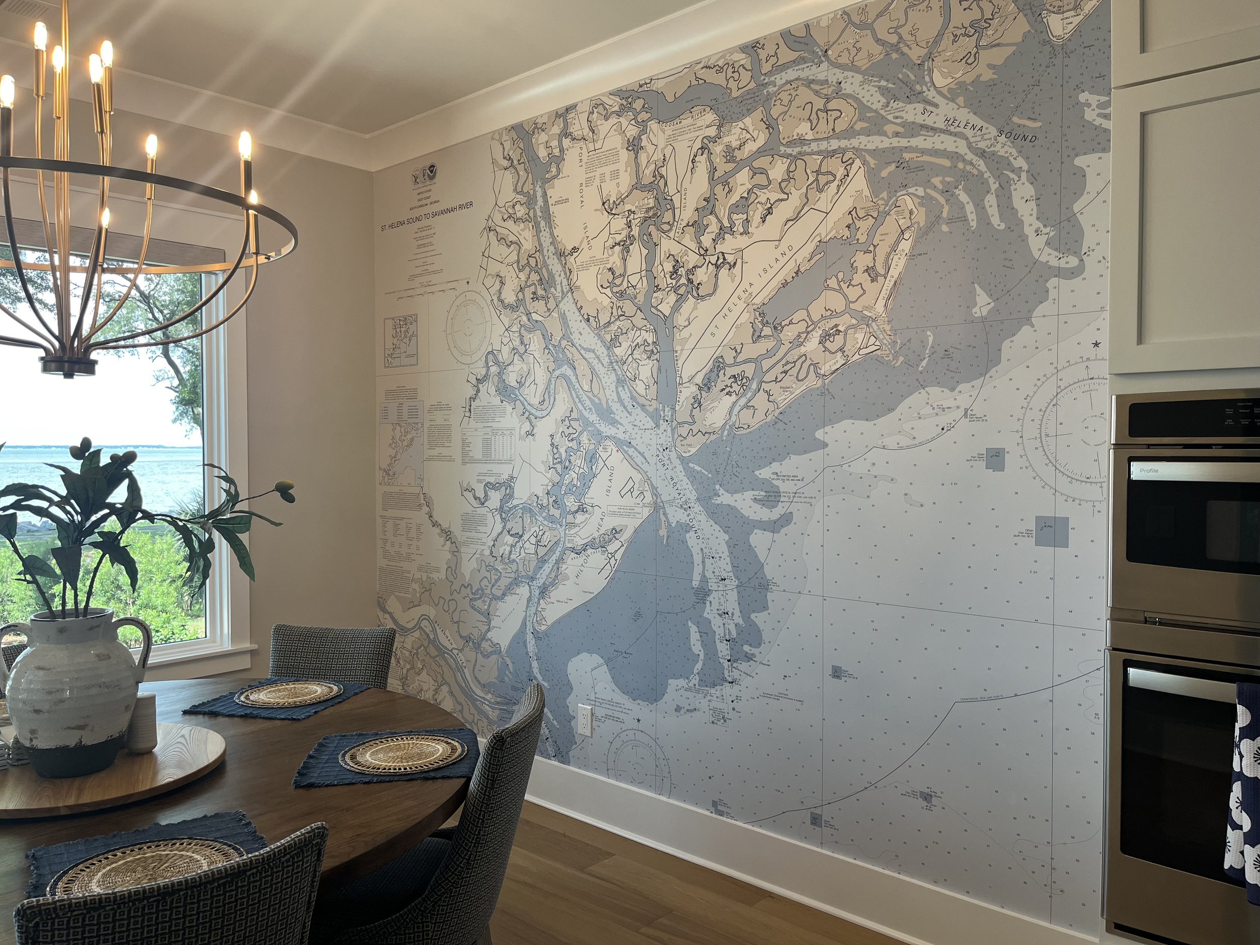
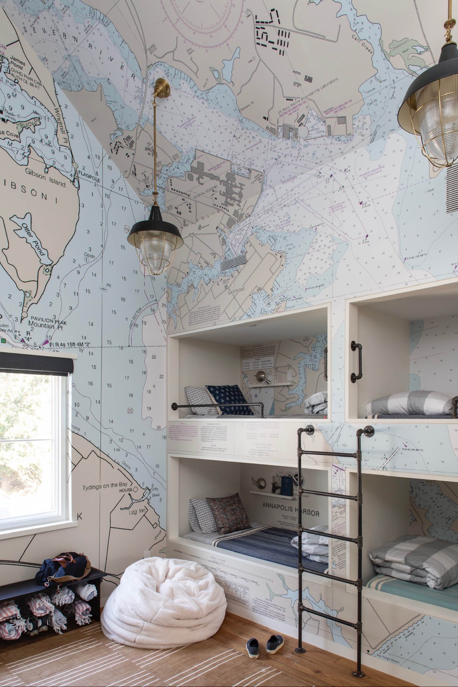
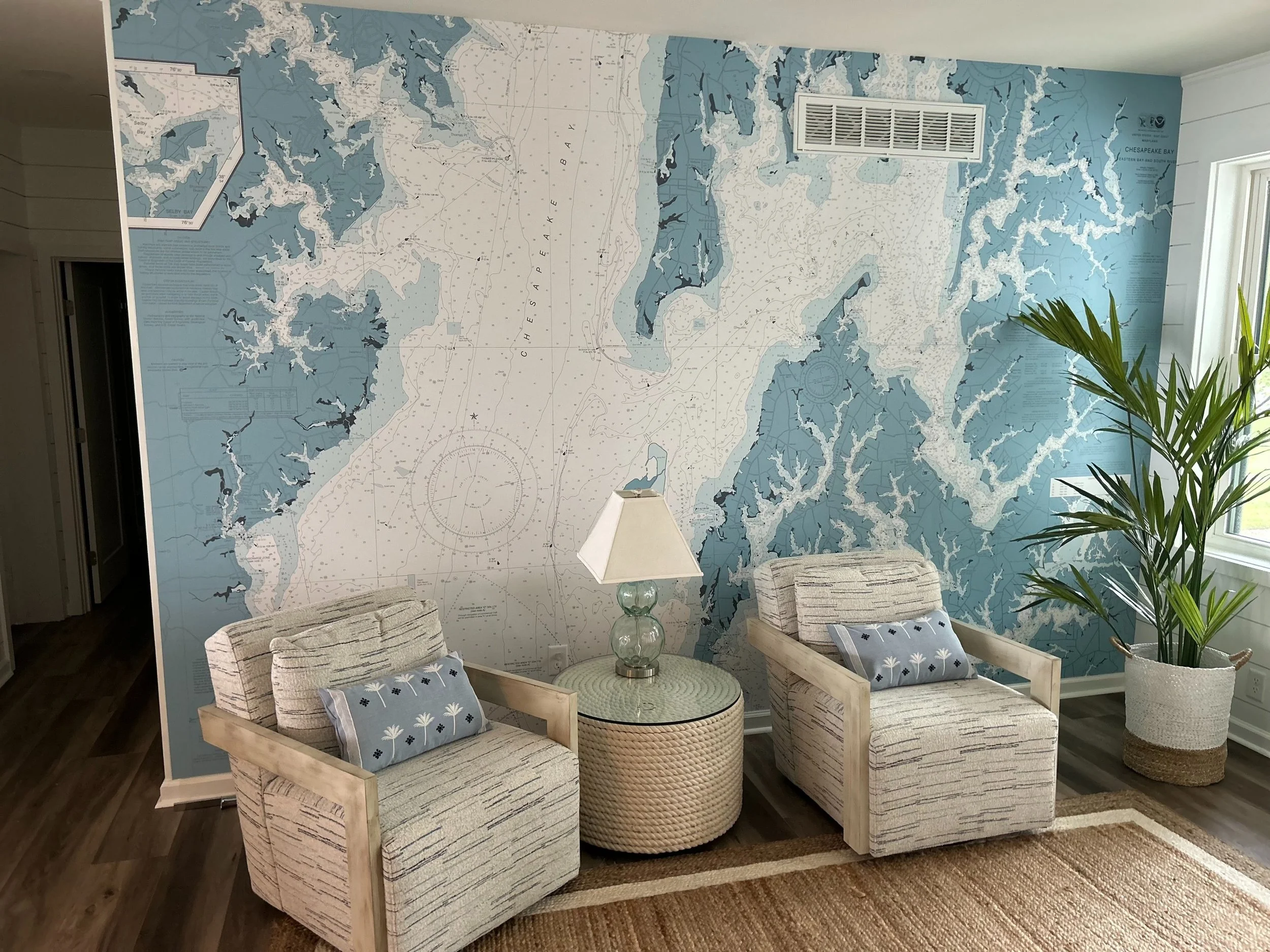
Traditional NOAA nautical chart colors have unique character. They were created for navigation, not decoration, yet they carry a distinctive visual language: pale blue water, warm land tones, crisp black type, intricate depth soundings, and the standout magenta used for navigational information.
For many clients, especially avid sailors, boaters, fishermen, and lifelong coastal or lake homeowners, that accuracy is deeply meaningful.
Our clients know charts. They have used them, collected them, studied them, and lived with them. The NOAA palette is not just a combination of hues; it is part of the chart’s identity. For many boaters, changing the chart colors too dramatically can feel like changing the chart itself. We understand that completely.
That is why most of our clients choose to keep NOAA colors. About 75% of our nautical chart wallpaper projects preserve the original palette with little or no adjustment.
There is a reason this approach works so well: standard NOAA colors showcase classic maritime style. In a beach retreat, lake house, study, hallway, cozy nook, bunk room, stairway, entry, sailboat cabin, or even on a ceiling, the precise chart tones feel timeless.
When a Color Change Makes Sense
Even when clients prefer the traditional NOAA look, a color refinement can help the chart settle more naturally into the room.
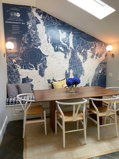
The custom adjustment we make most often is changing magenta chart details to navy blue. It is a small change that makes a big difference. Navy softens the contrast while preserving the structure of the chart. The mural still reads as a nautical chart, but the finished layout becomes easier to integrate into a polished interior.
This works especially well with navy cabinetry, blue-and-white textiles, tailored upholstery, or painted millwork. A color adjustment allows the chart to keep its maritime character while becoming more harmonious with the architecture and furnishings around it. For many clients, this is the ideal middle ground: true-to-chart NOAA styling with just enough customization.
Fully Custom Color Nautical Chart Wallpaper
All of our adjustments are 100% custom. We do not offer a fixed menu of color palettes or a standard set of pre-designed options. Instead, we personalize hues to each individual project.
Clients often send us:
Paint colors or cabinet colors
Fabric swatches or upholstery references
Interior design renderings
Photos of the room
Inspiration images from past projects
Favorite examples from our portfolio or Instagram
From there, we create a custom color direction while preserving the structure, detail, and integrity of the nautical chart.
The range can be delicate or dramatic. A bedroom or nursery might call for softer water tones and a more neutral composition. A restaurant or yacht may benefit from deeper contrast or a moodier palette. A modern coastal home might shine with a monochromatic chart, while a heritage property may call for more aged tones.
An important thing is for the chart to still look like a chart. Nautical charts have a natural hierarchy. Land, water, depths, labels, symbols, channels, and navigational markings all need to remain balanced. Custom color should support that structure, not overpower it.
When the colors are handled thoughtfully, the chart becomes part of the architecture. It feels considered, site-specific, and personal.
How to Choose Nautical Chart Colors for Your Space
Color decisions are easiest when we start with the room. The question is not only, “Which palette do I like?” but also, “What role should this wallpaper play in the space?”
If the chart location is the heart of the project — a beloved harbor, lake, coastline, or cruising route — the traditional NOAA colors may be the strongest choice. If the original palette is almost right, but one hue seems too bold, a subtle adjustment may be enough.
For locations with a very specific design direction, a fully custom palette may be the best fit. This is often true when working with designers, coordinating with millwork or upholstery, or creating nautical chart wallpaper for hotels, restaurants, cafés, retail shops, design showrooms, country club clubhouses, conference rooms, medical and dental offices, yacht clubs, hospitality spaces, and boat cabins.
A few questions can help guide the decision:
Should the finished wallpaper look like an authentic NOAA nautical chart?
Is the chart location personal, such as a family lake, favorite harbor, or meaningful coastline?
Will NOAA colors complement the existing finishes in the room?
Are there specific paint colors, fabrics, cabinet finishes, or architectural elements to consider?
Should the chart read as a focal point, or feel more integrated into the overall design?
Our Custom Nautical Chart Wallpaper Color Process
You do not need to have every decision made before reaching out. Many clients come to us with a clear vision, while others simply know they want the chart to be “softer,” “more classic,” “less bright,” or “more navy.”
That is enough to begin.
If you have specific paint colors or design references, we can work from those. If you are not sure where to start, we can point you toward past projects in our portfolio. If you have an inspiration photo from another space, we can use it as a guide and create a custom chart palette that captures a similar feeling.
This is a highly collaborative part of the process. We study the chart, the architecture, the room, and the overall design direction before making recommendations. Nautical chart wallpaper should feel scaled and composed for that exact installation.
The Best Color Choice Is the One That Belongs
Standard NOAA colors and custom color nautical charts each have their place. The traditional palette brings authenticity, history, and classic maritime character. A palette adjustment can make the chart more refined while preserving its historic spirit. A fully custom palette can transform a meaningful chart into a wallcovering that integrates with any interior.
At Nautical Chart Wallpaper, every chart is designed to tell the story of a place, honor waters that matter to clients, and enhance a special ambience.
To start your own custom nautical chart wallpaper project, please contact us. Whether you are drawn to traditional NOAA colors or a custom palette designed around your space, we can help create a chart wallpaper that is polished, tailor-made, and color specific.
For more on planning your project, see our guide on how to measure for nautical chart wallpaper.

Meg Paetow, Bayside Interiors