Land Ho! In "Kay Gray"!
One of my favorite TV shows is Brain Games, particularly the episodes where they test color perception and fool everyone. Sometimes just I’m convinced that I can see through their color comparisons, but I usually end up fooled completely.

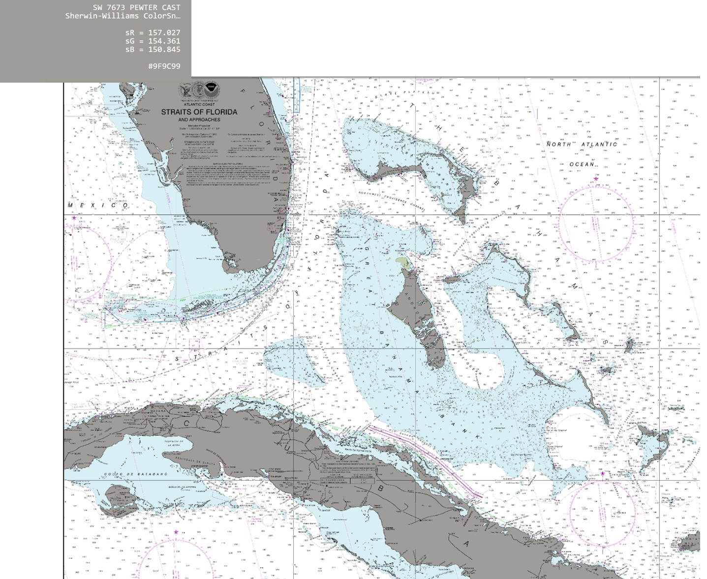
Sherwin-Williams Pewter Cast
Such was the case with a recent client of mine, Kay Riordan, who decided she wanted the Bahamas, southern, Florida and part of Cuba changed from NOAA’s beige area to gray. I agreed to do that but I told her to stop by the paint store and give me the exact name and number of the paint swatch that she liked for the land. She spent considerable time making her decision, and here is what she chose: Sherwin-Williams Pewter Cast.
So I sent it down to Katherine who does all our color changes, and after she had performed her magic, she sent the following image back to me. When I looked at it I figured that she must have made a horrible mistake. Obviously it was too dark!

Katherine, who does excellent work with our color changes surely must have misunderstood my instructions and made the gray area way too dark from the swatch I sent. I was just about to make a call to her when I thought it might be instructive to show the swatch next to her work. But when I did, this is what I saw. The color was on the money!
In retrospect, I think I was fooled by the text in the sample being white and the text on the Florida piece being black. Did it fool you? Well, long story short, the client loved it and it is in the printing stage now.
I must confess that at first, I balked with her color change, but it has since grown on me. The biggest improvement over the original land color is that now the small islands really stand out as compared with NOAA’s beige colors.
Like I always say, my clients are the designers and I just help them out.
Way to go Kay!