Too Much "Information"
"Too Much Information!" You have heard it before, probably said it before. And it usually gets a laugh!
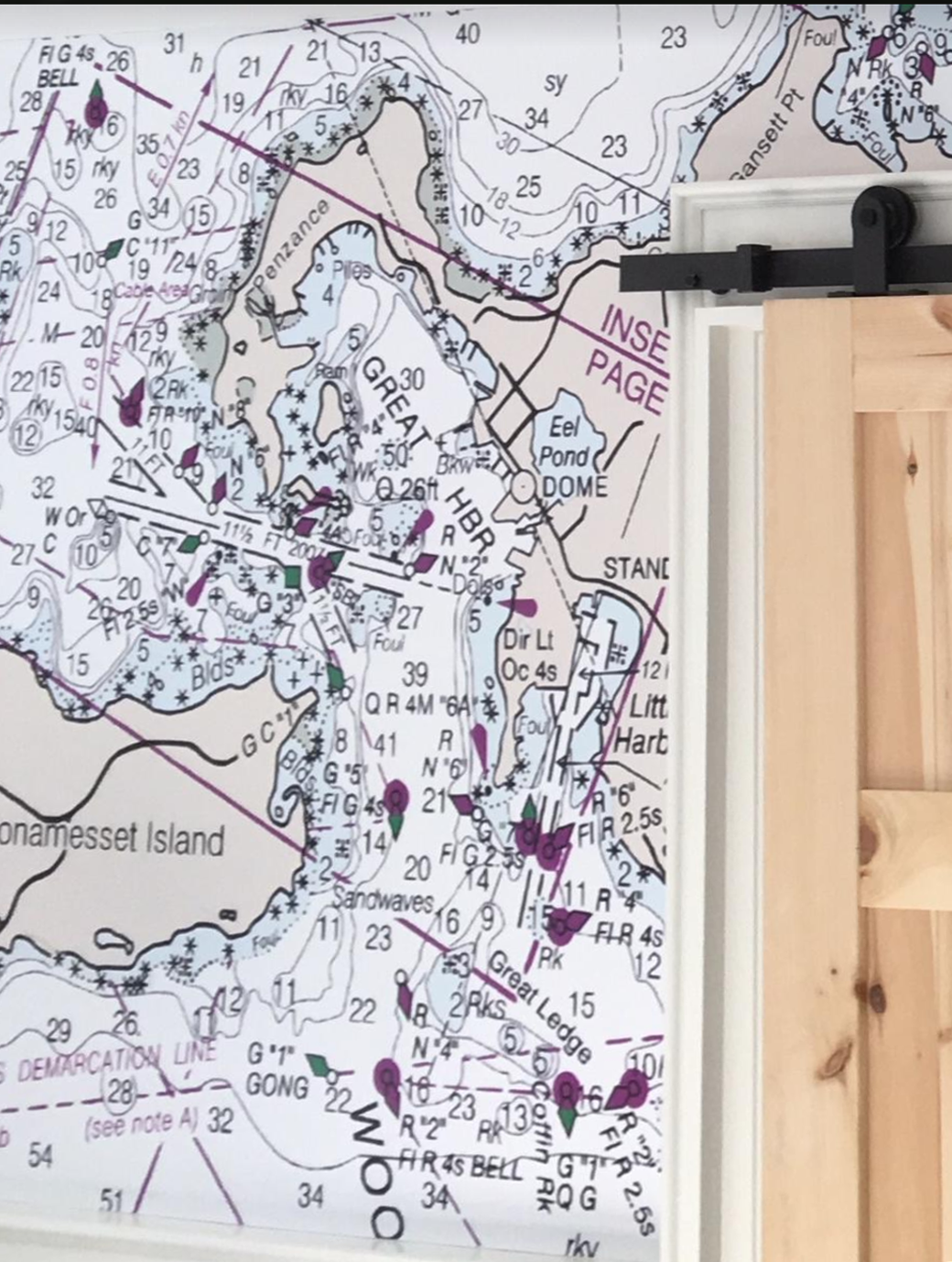
But sometimes there IS such a thing as too much VISUAL information. Take, for example, a call I had this week. She is a designer who said that the mural we created had too much detail in a portion of the mural we designed. It was, visually, "too much information."
Things look calm to the right of the door, but a bit CRAZY to the left!
Now if it had been any other company who did the mural, she would have been stuck, because all of the other custom wallpaper companies, simply reproduce what they are given.
We are the only company who will reconstruct a chart according to the needs of the client, which is what we did for her.
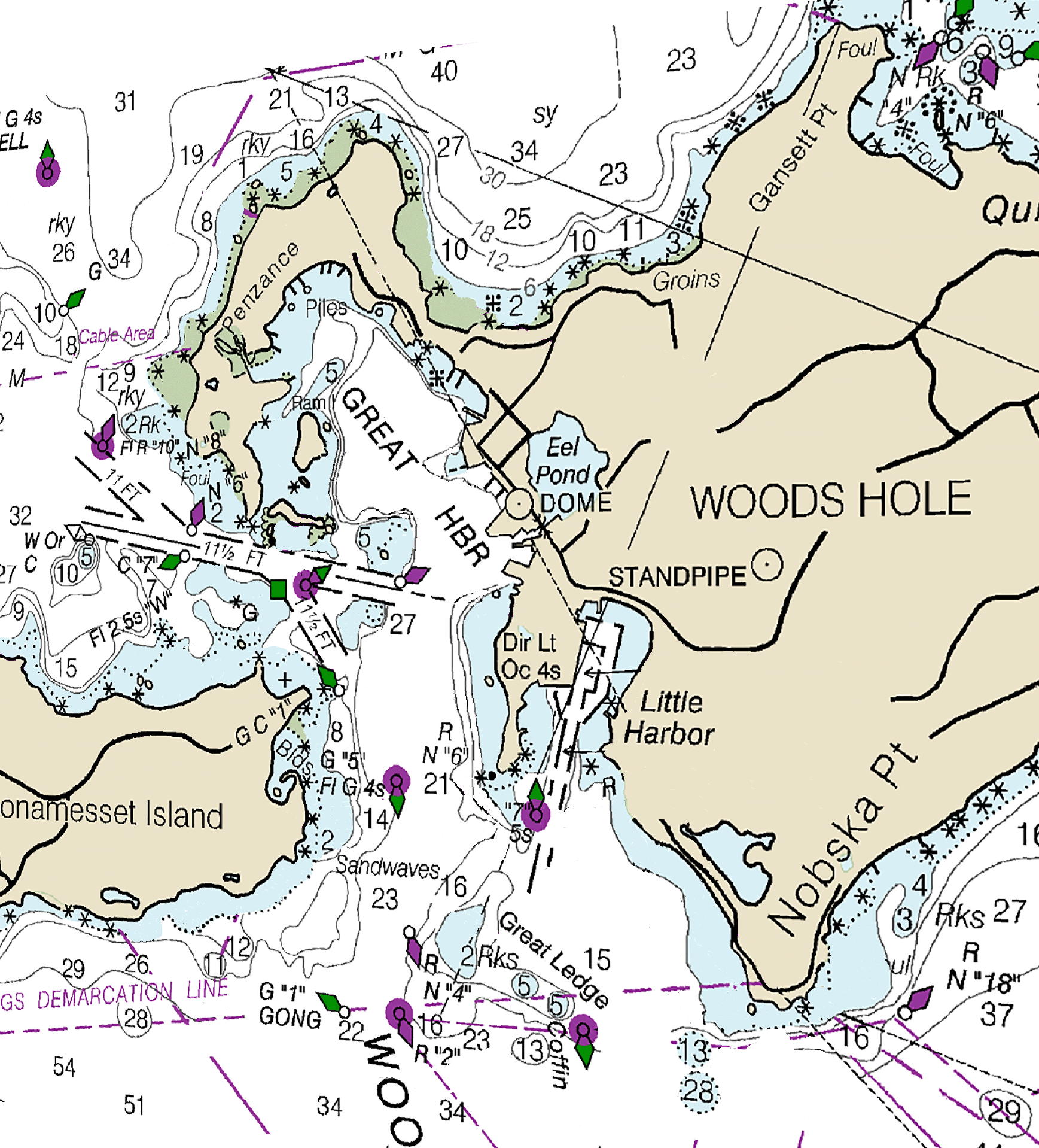
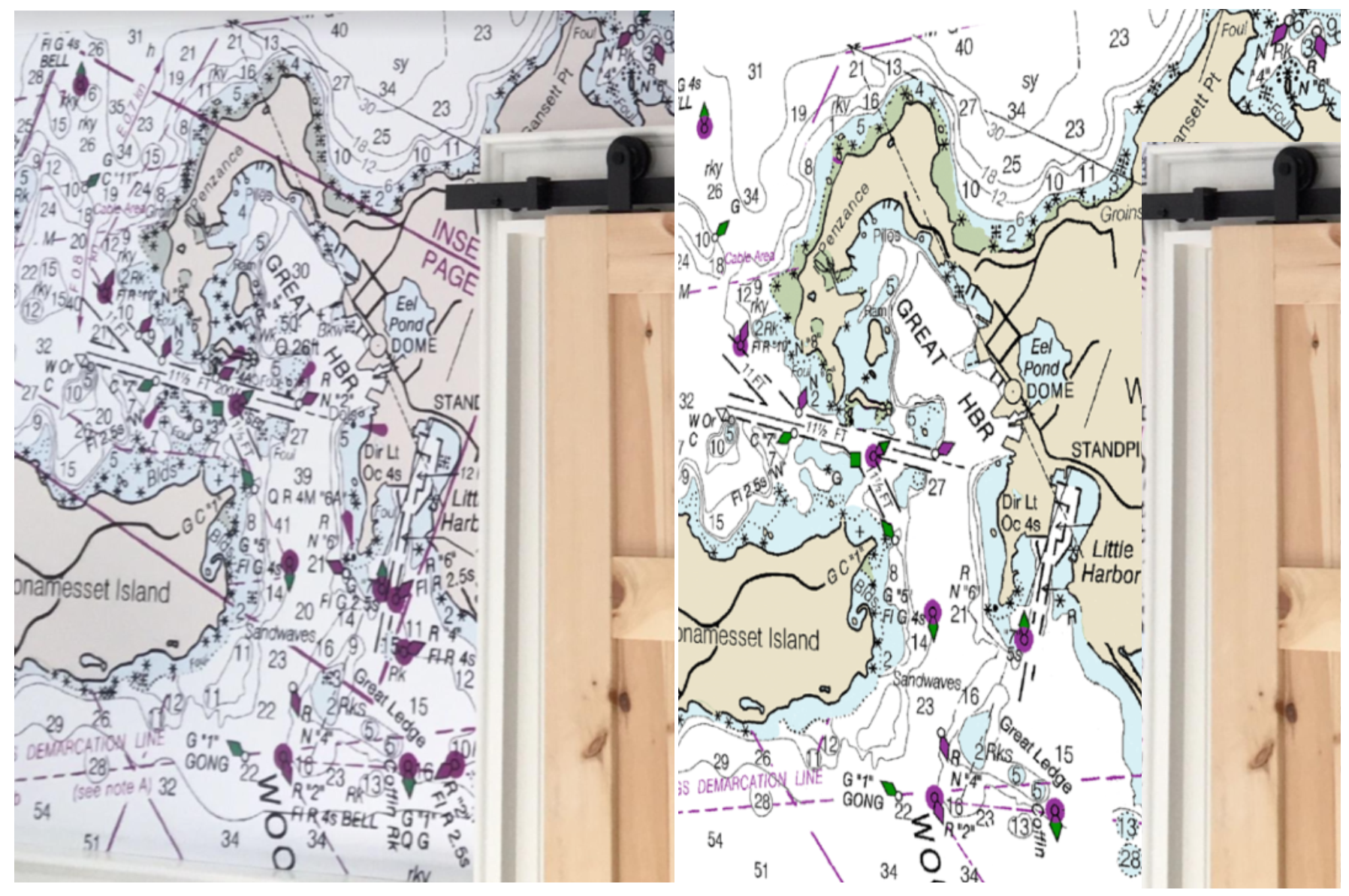
You can see her point in this first and second illustration. It really IS too busy for a chart that is not a harbor chart. So we agreed to simplify the chart by taking out rocks, shallow water indicators, fathom marks, text, etc. to simplify the look.
After all, this mural will not be used to navigate Woods Hole, so why not?
Still, we left enough detail to show that there is a navigable channel going into Woods Hole, and some shallow water to steer away from.
In short, we did not change the message of the chart that this is a harbor that needs your attention, but we don't assault our visual sense with too much information.
At the risk of sounding too boastful, I am indeed proud that we have the ability to customize beyond simply enlarging the image and that we are happy to meet our client's needs regardless of the difficulty.
So do you have a nautical chart that you want to be made into a mural? Do you have an imagination that goes beyond what you see on the chart?
Here is the "Before" on the left, and the "After" on the right
You have come to the right place! Let's make your mural dreams come true!
Let's talk about your ideas for a mural. We welcome mural conversations even if you are not ready to order yet!
Call or text us at (801) 989-8083 or email us at Info@nauticalwalls.com


