Creative Color in Topographical Maps
Not everyone can live on the coast and have a nautical chart mural proudly displaying their home or favorite sailing haunts. Some of us - myself included - live inland. For the landlocked, there are topographical maps that do an amazing job of displaying our stomping grounds in a colorful mural.
But topos often have colors that our clients want to have changed. No worries, we are the best at changing colors to match the color schemes of our clients.
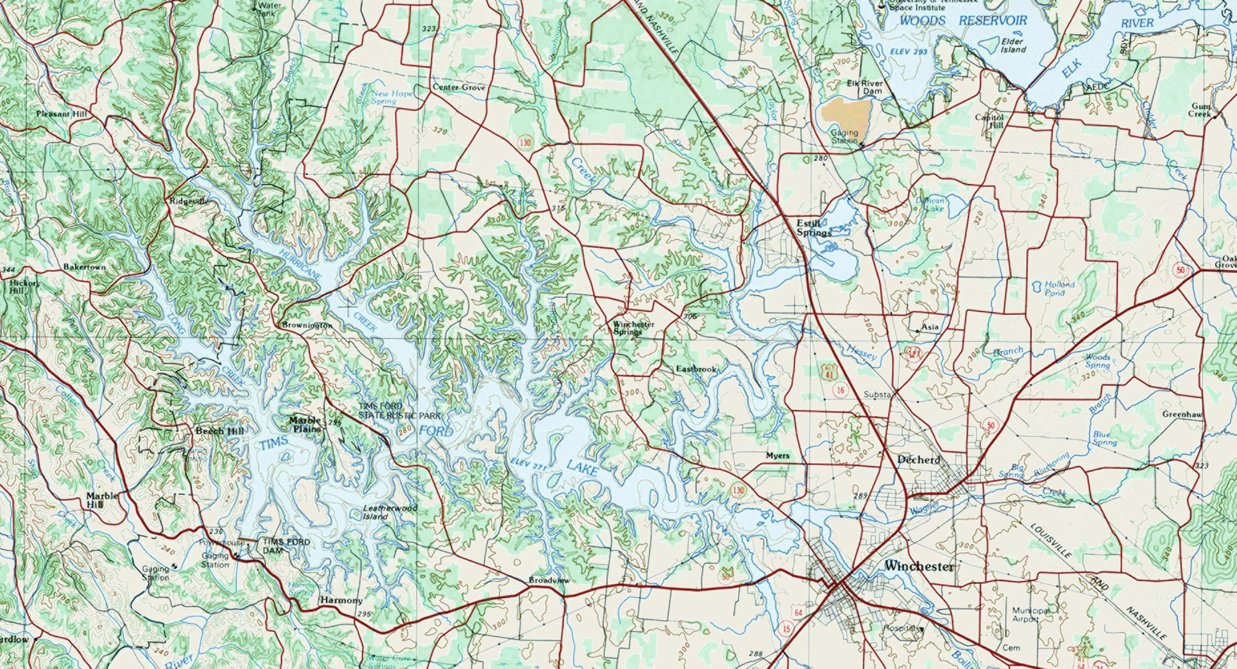
Right now, for example, we are working with a client who lives in a very rural part of Tennessee. She wants a topo mural for her powder room but wants the colors to pop more than they do in a regular topo map. I've taken just a portion of her chart to show you how it looks in the original topo colors.
Here is how the original topo looked before any color treatments:
Her walls are painted in Benjamin-Moore color, Swiss Coffee OC-45. With that in mind, she wanted four color corrections made to the topographical map. (See color samples, Swiss Coffee, Greenwood Lake, Creamy Orange and Saffireberry)
Our graphics specialist, Kathryn Tyler made the changes and did them so that the colors will be intact upon enlargement (our standard procedure).
The topographical map looked like this after the four color changes were made:
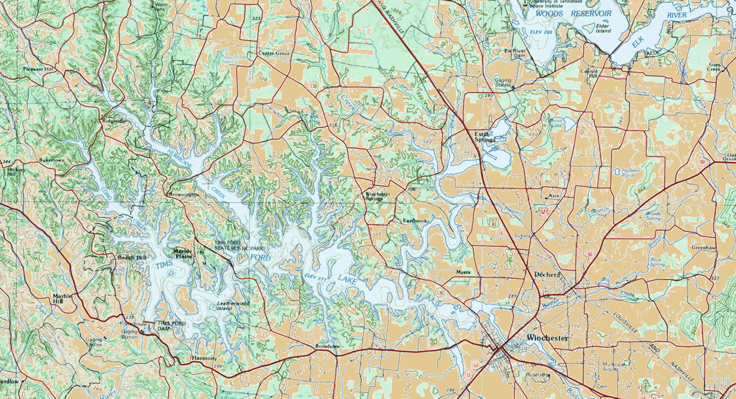
It was a change for the better, but our client still wanted more color. For the second round, she asked us to change the Swiss Coffee color to Creamy Orange, leaving the other changes where they were. Kathryn made the requested change and the topo now looks like this:
Here is the take-home point: While generally there are not any right or wrong answers to how to make color changes in your mural, there is a right answer for you, the client. Some choices are better than others; some choices make your wall the conversation piece you want in your home or office. Don't be afraid to explore the options. It is your wall, and we want to work with you to make it come to life.


