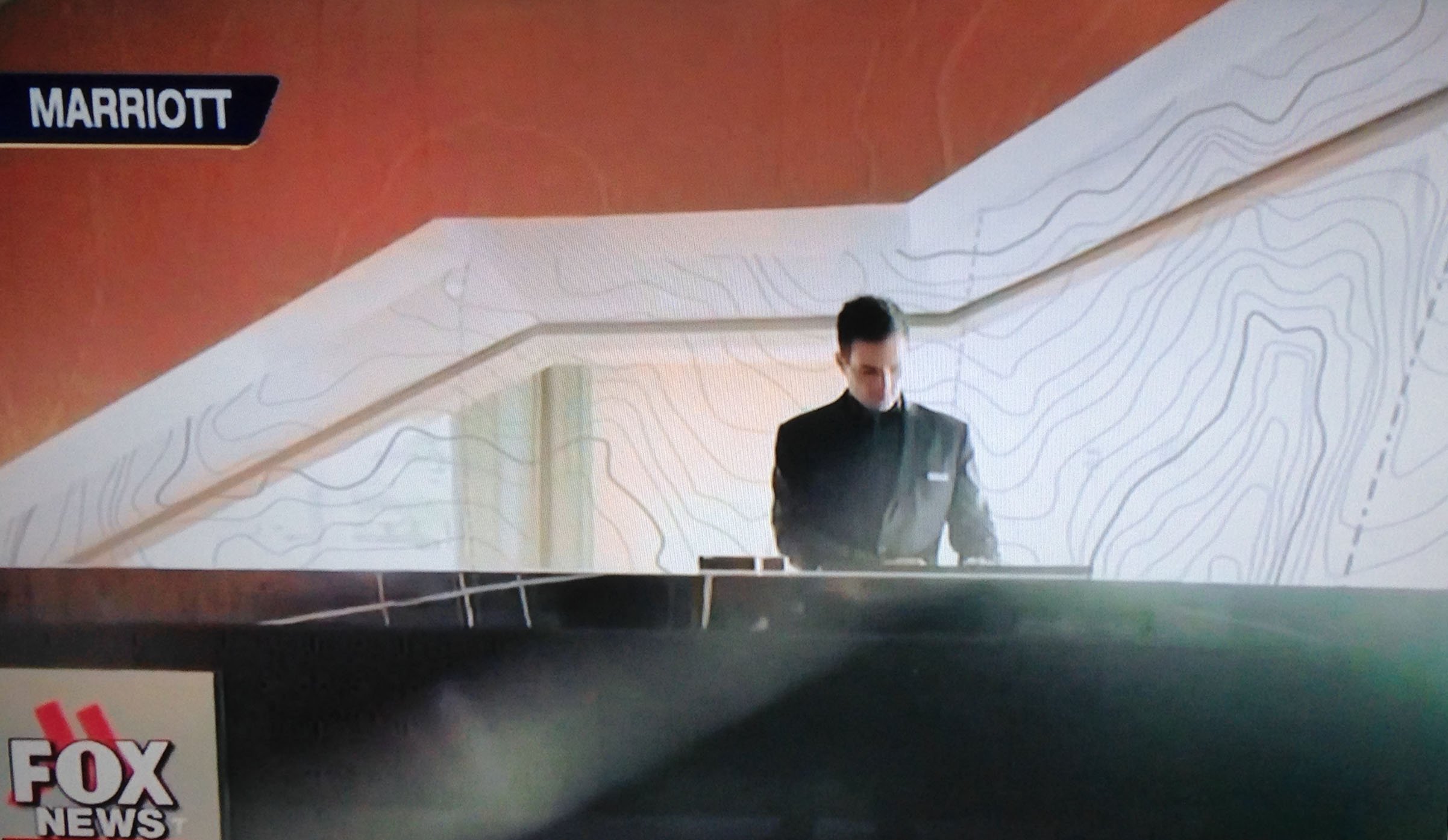
Topo III: Just one more thing . . .
A topo, like a nautical chart comes with colors that you get used to. In a NOAA chart, you will see beige/yellow for land, blue, white, sage green, magenta, and black. A topo has green, brown, blue, and black, but will use other colors for various purposes depending on the chart.
And, because of Photoshop, those colors can indeed be changed.
Which brings us to our picture. I was watching the news and saw a special on Willard Marriott and the Marriott hotel chain. I’m not sure which one of the 4,000 + hotels this was taken from, but take a look at the wall – it is a topographic map! Sure the colors have been altered to black and white, but it is classy enough to make the foyer in a Marriott.
So what do you think? If a topo is stylish enough for a Marriott Hotel, isn’t a map mural classy enough for your home or office?
Give us a call. Let’s talk.

